
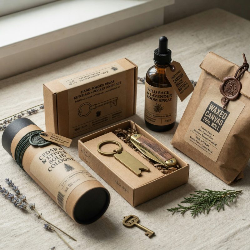
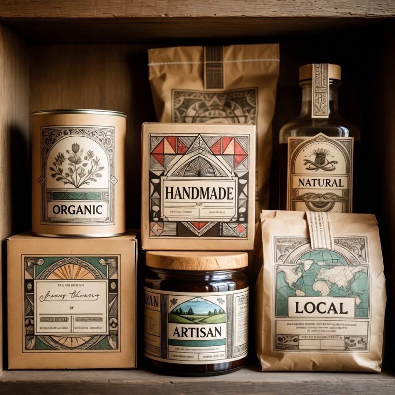
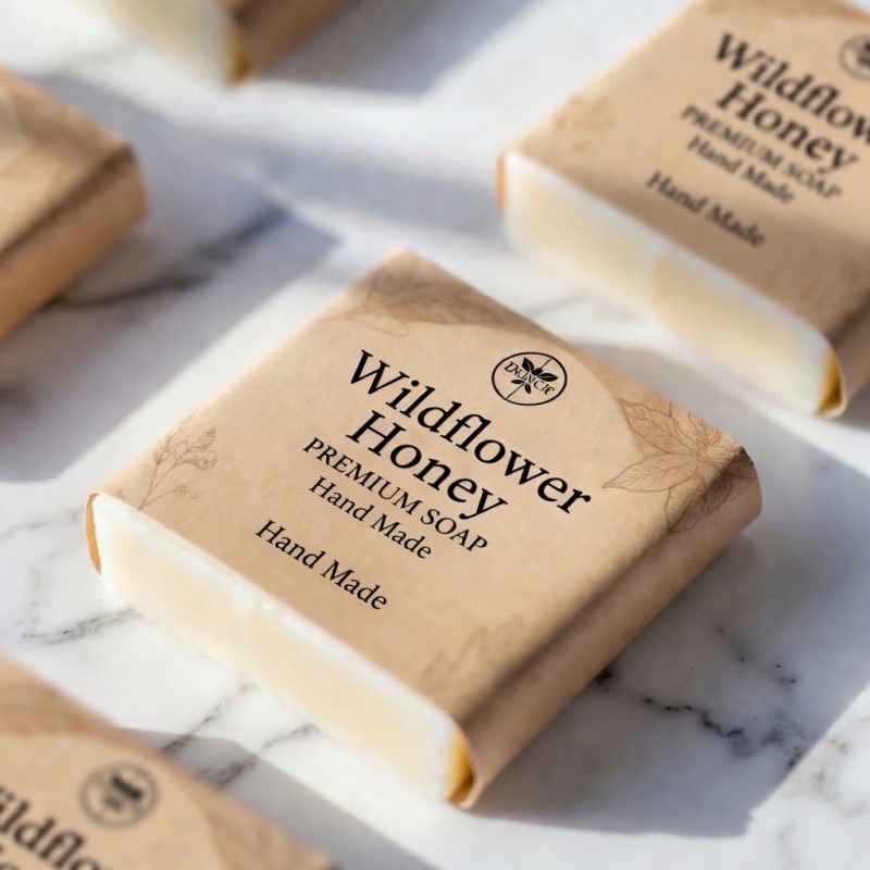
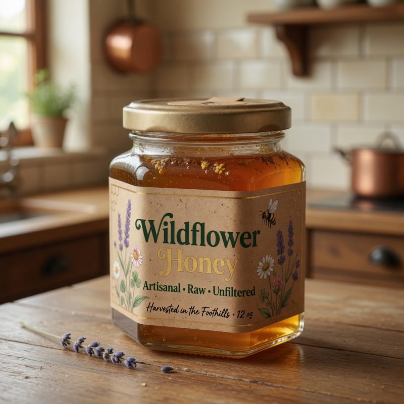
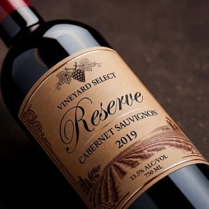
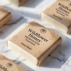
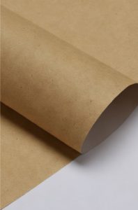
Kraft Paper Labels
Give your products a natural, rustic, and eco-friendly look with our high-quality Kraft paper labels. Printed in vibrant full color with excellent detail, these labels have a classic brown paper texture that customers love. Perfect for food & beverage, coffee & tea, candles, soaps, honey jars, spices, and artisanal goods.


Select Options
Custom Printed Labels with personalized service
When you choose EPIK, you are choosing a partner that is dedicated to bringing you amazing products and service. We are always a call away to answer any questions or help you with your label order.
The kraft paper has a lovely natural texture. They make my products look handmade and upscale.
These kraft paper labels are excellent. The rustic aesthetic is spot on and the quality is top notch.
The kraft labels are thick and durable. Ink doesn’t bleed and they stick very well.
These labels have the perfect kraft look. They feel high quality and elevate my packaging.
Solid kraft labels. The paper quality feels high-end and they adhere nicely to jars and boxes.